
Think Pink: How the Color of Joy, Romance, and Rebellion Took Over Interiors
- Aug 15, 2025
- 7 min read
Step into a well-designed room and there’s often one unexpected moment that pulls you in. Not the chandelier or the curated coffee table books—but a feeling. A shift in tone. A flash of something familiar, reimagined. That’s the power of pink right now.

Once dismissed as juvenile, or strictly feminine, pink is reentering the design conversation with a quiet boldness. It’s no longer about bubblegum walls or blush throw pillows. Instead, we’re seeing earthen pinks that feel like aged clay, fuchsias lacquered to high gloss, and barely-there tones that whisper rather than shout.
In 2025, pink is complicated. And that’s exactly why it works. It’s being used with precision and purpose—sometimes romantic, sometimes radical. Whether grounding a warm minimalist living room or elevating a sculptural powder room, pink is proving it’s far more than a trend. It’s a tool. A tone. A design statement all its own.
Psychology & History: The Gender Politics of Pink
Pink wasn’t always feminine. In fact, 18th-century men wore it proudly—embroidered waistcoats, tailored jackets, and powdered rose-colored wigs were signs of affluence and refinement. It wasn’t until post-WWII marketing campaigns began assigning blue to boys and pink to girls that color became gendered.
Now, we’re watching that history unwind.
Designers are reclaiming pink as a powerful, expressive neutral. Think Baroque maximalist pink rooms or the subtle blush tones layered into masculine modernism. This shift isn't just aesthetic—it’s cultural. Pink no longer needs to be justified. It simply needs to be used well.

Shop "Classic" Pink

Shop Hale Canvas Six-Drawer Dresser @ Anthropologie

Shop Basketweave Pouf, Pink @ One Kings Lane

Shop Malo Medallion Rug, Pink @ One Kings Lane

Think Pink—But Forget What You Think You Know
After years of grey-dominated interiors and beige minimalism, people are ready to have fun with color again. Designers are leaning into palettes that feel expressive, layered, and even a little playful—without sacrificing sophistication. Pink, once a controversial choice, has emerged as one of the most versatile players in this shift.
The pinks of 2025 are complex, earthy, architectural, and emotionally layered. They're not here to play nice—they're here to say something.
Think of pink as less of a color and more of a design device: a way to warm a stark palette, soften strong lines, or inject just enough surprise to make a space feel alive. Whether used in a Rococo-inspired powder room or a modern lounge with blush-toned plaster walls, pink has evolved into a statement hue that defies its reputation. In the right hands, it’s not cute. It’s cultured.
Design Trends: How Pink Is Shaping the 2025 Palette
Pink has officially crossed the line from accent color to design philosophy. In both residential and commercial spaces, it’s emerging in palettes that are emotionally resonant and spatially refined. Here’s where we’re seeing it now:
Rococo Revival
Think soft pink walls, ornate trim, and carved wood details. The look is romantic but not precious—balancing pastel tones with aged finishes and antique brass.
Pink + Brown Palettes
Blush upholstery against deep coffee-colored walls. Warm walnut cabinetry beside rosy-toned tile. The pairing feels nostalgic, layered, and earthy.
Pink + Black (and White)
A timeless fashion-inspired palette moving into interiors. Black provides structure, white keeps it crisp, and pink adds warmth and personality—whether it’s a blush sofa on a black-and-white checkered floor or a rose-toned velvet chair against matte black walls.
Unexpected Applications
Kitchens, home offices, and libraries—spaces that traditionally skew neutral—are embracing pink in bolder ways. Matte pink cabinetry, dusty rose built-ins, and even magenta bathroom vanities are showing up in luxe homes.
Dopamine Décor
Pink is becoming part of an intentional movement toward feel-good design. These aren’t careless bursts of color—they’re calculated injections of joy.
Barely-There Pink
Whisper-light shades with just a touch of warmth—so subtle they almost read as cream or beige—are replacing white in high-end minimalist interiors. These pale tones add depth and softness without feeling overtly “pink,” making them ideal for walls, upholstery, or even kitchen cabinetry in spaces that lean toward quiet luxury.

Shop "Barely-There" Pink

Shop Widell + Boschetti Laurent Velvet & Sherpa Chair @ Bergdorf Goodman

Shop Claro Goblets, Pink S/4 @ One Kings Lane

Shop Luna Waste Basket @ Anthropologie
Pink + Black (and White): Timeless Contrast, Modern Edge
Few color combinations strike a balance between elegance and impact quite like pink paired with black—or with the crisp balance of black and white. It’s a classic fashion palette that translates beautifully into interiors, offering sophistication with just the right amount of drama.
In black-and-white spaces, pink acts as the disruptor—the touch of warmth that breaks up the formality. Imagine a blush sofa against a graphic black-and-white checkered floor, or pale pink cabinetry in a kitchen with marble counters and black hardware. The result is clean, tailored, and endlessly photogenic.

Pairing pink directly with black creates a moodier, more assertive aesthetic. A rose-toned velvet headboard framed by black-painted walls feels romantic yet grounded. A powder room with matte black tile, pink plaster walls, and brass accents can feel both chic and unexpected.
Whether you go for the high-contrast boldness of pink-and-black or the graphic precision of pink in a black-and-white scheme, this trio’s secret is balance: the black provides structure, the white keeps it airy, and the pink adds personality and warmth.

Shop "Pink & Black"

Shop Climbing Cubs Hand-Knotted Rug, 9' x 12' @ Bergdorf Goodman

Shop Paule Marrot, Black and White Abstracts @ One Kings Lane

Shop Daphne Hand-Knotted Rug, 8' x 10' @ Bergdorf Goodman

Rich, Earthen Shades: Pink Goes Organic
These are pinks with soul. Dusty rose, terracotta blush, clay pink, and mauve with hints of brown or gray. They feel grounded and architectural—more akin to weathered plaster or desert minerals than nursery paint.
This spectrum of pink acts as a natural complement to stone, wood, and oxidized metal. A clay pink wall in a Japandi-style living room? Effortless. A clay-pink boho lounge layered with velvet, plants, and sun-warmed tones? Rich and textural. These pinks don’t scream. They soften the room while grounding the overall palette.

Shop "Earthy" Pink

Shop Luxe Linen Blend Pillow, Blush @ Anthropologie

Shop 1970s Pink Splatterware Vase @ One Kings Lane

Shop Reeves Portuguese Stoneware Dinner Plates, Peony, Set of 4 @ Anthropologie
Redefined Hues: From Bubblegum to Oxidized Blush
On the other side of the spectrum, vibrant pinks are making a bold comeback—but not in the way you might remember them.
Instead of playful or childish, today’s high-saturation pinks are being used deliberately. A bubblegum-pink kitchen island framed by sleek walnut cabinetry. A lacquered hot-pink powder room with black marble flooring. A sculptural magenta coffee table sitting beneath a vintage Murano chandelier.
In the right setting, bold pink reads less like a novelty and more like a signature—refined, confident, and impossible to ignore.


Material Matters: The Tactile Side of Pink
Pink transforms dramatically depending on its material expression.
A dusty pink wall in lime plaster feels soft and artisanal.
A velvet blush sectional reads as decadent and lounge-worthy.
Rose gold fixtures in a matte finish add warmth without sparkle.
Pink terrazzo flooring adds movement and whimsy to an otherwise simple bath.
When pink is applied thoughtfully to texture-rich surfaces—ceramic, bouclé, brushed metals, even leather—it becomes more about touch than color. That tactility is what elevates it from trendy to timeless.

Shop "Tactile" Pink

Shop French Peach-Pink Silk Velvet Pillow @ One Kings Lane

Shop Tova Cotton Velour Towel Collection, Rasberry @ Anthropologie

Shop Adelina Velvet Pillow, Hot Pink @ Anthropologie


Style Profiles: How to Use Pink Without Being Literal
Here’s how to work with pink in a way that’s modern, grown-up, and unexpected:
Tonal Layering: Blend soft blush, muted mauve, and dusty rose in a single space for a rich, cohesive look. Perfect in bedrooms and quiet lounge zones.
Contrast Pairing: Combine pink with deep olive, navy, or rust to create high visual impact. Try blush linen drapes in a moody green office or a pink chair in a burnt sienna nook.
Singular Statement: Introduce just one bold pink piece—a sculptural chandelier, a rug with pink marbling, or a single piece of art. Let it stand alone.
Balancing Act: Temper pink with grounding materials—wood, blackened metal, tan leather, even raw concrete. These counterpoints keep the look sophisticated and dimensional.
Shop "Contrast Pairing" Pink

Shop Effie Lena Velvet Tripod Chair @ Anthropologie

Shop Harper Indoor/Outdoor Pillow @ One Kings Lane

Shop Ren Printed, Pink and Green, Floral Rug @ Anthropologie
Pink Overhead: Ceilings That Warm from Above
Painting the ceiling pink is an unexpected way to shift a room’s mood without overwhelming the walls. A muted blush or dusty rose overhead creates a soft, flattering glow, subtly reflecting warmth onto everything below. In bright spaces, it adds dimension; in cozier rooms, it envelops without feeling heavy. Paired with light walls and grounded furnishings, a pink ceiling becomes less about “statement” and more about atmosphere—quietly transforming how the space feels the moment you walk in.

Wrap-Up: Pink Interiors
Pink isn’t precious anymore. It’s provocative. Playful. And when used well, undeniably chic.
Whether it’s a rusty mauve in a minimalist living room or a fearless fuchsia moment in a modern kitchen, pink interiors offer a fresh way to explore emotion, warmth, and design depth. It can evoke softness without weakness and nostalgia without kitsch.
So yes—think pink. But think smart. Think subversive. Think like a designer who knows this color isn’t just pretty—it’s powerful.
Love the look but not sure how to incorporate it into your home? That’s where we come in. For more in-depth services, see "Interior Design Services" below & visit our Interior Design Studio Cley Atelier.
We just couldn't get enough of these fun pink looks so Shop Bonus Pink items below:
Shop Pink & Red

Shop Zad Rug, Red Pink/ Ivory @ One Kings Lane

Shop Pink Shaded Stemmed Flute Glasses, Set of 2 @ Bergdorf Goodman

Shop Red & Punk Striped ruffle Pillow @ Anthropologie
Shop Pink Art
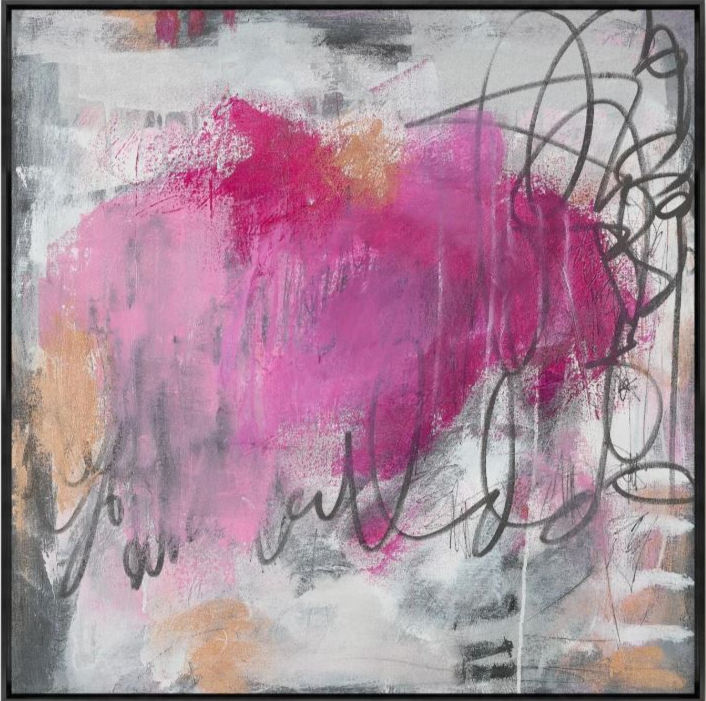
Shop Pink Lemonade 2, 41"x41" @ Z Gallerie

Shop Lillian August, Pink Haze @ One Kings Lane

Shop Lillian August, Pink Bandana @ Amazon
Shop Peachy Pink

Shop The Eloise Scallop Milk Glass Table Lamp @ Anthropologie

Shop Willoughby 79" Cordelia Jacquard Sofa @ Anthropologie

Shop Lee Brass Pink Floral Fabric Shade Wall Sconce @ Anthropologie
Treat yourself to some Luxury Pink Details

Shop Lalique Bacchantes Pink Luster Vase @ Bergdorf Goodman

Shop One-Of-A-Kind Pink Daisy @ Bergdorf Goodman

Shop Clara Rose Scented Candle @ Bergdorf Goodman


_edited.png)


_edited.png)


